


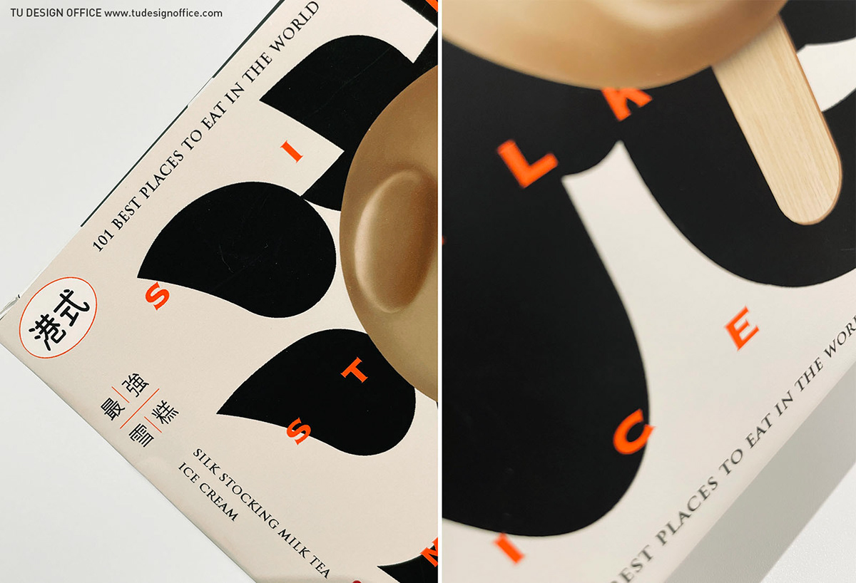
Silkstocking Milk Tea Ice Bar
With the cute pig shape of the popsicle itself, the packaging design uses the word "Hong Kong" as the main visual element, and is written in a rich and rounded font. It presents the font in a full-page layout, hoping to emphasize the authentic and local atmosphere of this product from Hong Kong. Our goal is to make the packaging of the popsicle different from the usual style, and to create a modern and traditional Hong Kong packaging design.
點點心絲襪奶茶豬雪糕
配合冰棒本身為可愛的豬造型,包裝設計上以「港」字為主視覺元素,並以肥沃飽滿、圓潤的書法字體撰寫設計,同時將字體以滿版的編排呈現,希望強調本產品來自香港,既正宗又道地的氛圍。我們目標讓冰棒包裝,能有別以往常見的風格,塑造出既現代感,又帶有傳統港味之包裝設計。


Design by TU DESIGN OFFICE


